Turning a debt-collection interface into a daily health utility
Jireh Health is a healthcare payment platform that helps people pay for medical care more affordably. When I joined, the product had the right mission but the wrong experience , users only opened it when something went wrong. I led the end-to-end redesign across three interconnected modules to change that.
Disclaimer: Some details in this case study may be vague to protect client IP under NDA.
Context
The problem
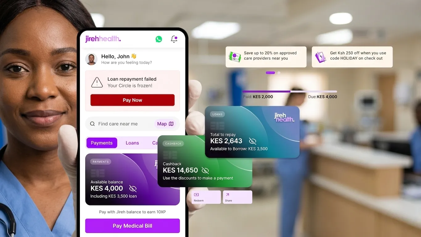
The repayment experience was the first thing users saw, and it led with a bold "Total to Repay," multiple alert states, and a dense history of submitted treatments. It felt punitive, not supportive. The app was designed around a single moment, paying a bill, rather than the full reality of what healthcare caregivers and patients actually deal with every day.
Usability testing confirmed what the numbers suggested: users saw no utility beyond debt repayment. They came back only when a payment was due or a discount was expiring, both infrequent events.
Project Details
-
Role
Senior Product Designer -
Tools
Figma, Gemini, DeepSeek -
Team
Founder, 1 PM, 2 Engineers -
Duration
10 Weeks
Research & Direction
What users were telling us, but not in so many words
The team had already done foundational research. Rather than restart from scratch, I worked closely with the PM to map existing personas and user insights directly to design priorities. I also used Gemini AI to surface the emotional subtext behind user messages, feeding anonymised persona data with the prompt: "What are the top 5 unspoken emotional states behind these messages?" The response, exhaustion, confusion about where to spend, fear of missing medication, resentment from unsupported caregiving, and guilt about taking loans, became my five design principles.
"Many small chemists don't even stock the needed drugs, or they sell them at prices we just can't afford. Public hospitals run out."
"It's not worth it to give care. People have been there for 13 years, but now they get tired."
"I know a lot about her condition, but I don't actually collect the data anywhere. I just constantly worry if she takes her medications on time."
The dashboard was only solving for repayment. It wasn't solving for logistics (where to spend money), motivation (why keep going), or cognitive load (what to do today). Those three gaps became the brief.

Design
Dashboard redesign, from debt-first to care-first

The original home screen tried to carry too much. Credit score, XP, borrowing limit, CareFund balance, and points were all surfaced upfront, a status board with no clear action. It told users where they stood without helping them move forward.
I restructured the information architecture around a single question: what does this person need to do or know today? That meant making a series of deliberate calls about what stays, what moves, and what gets removed entirely.
What I moved, and why
I pushed to relocate social reputation metrics, XP, credit score, trust tier, to the profile section. My argument was simple: that data belongs in a context where users are actively reviewing their progress, not as the first thing they see every session. The founder agreed once I framed it as reducing friction on the path to the app's core utility. That cleared the home screen to do one job well.
Information Architecture
7 Core Sections

The financial widget, clarity over completeness
"Available to Borrow" was buried and hard to parse. I redesigned this into a single, prominent card with plain-language framing: here is how much you can borrow today. Not a score, not a range, a specific, usable number. I also replaced the CareFund balance with cashback visibility, which had more immediate relevance for daily spending decisions.
The daily health log, turning anxiety into action
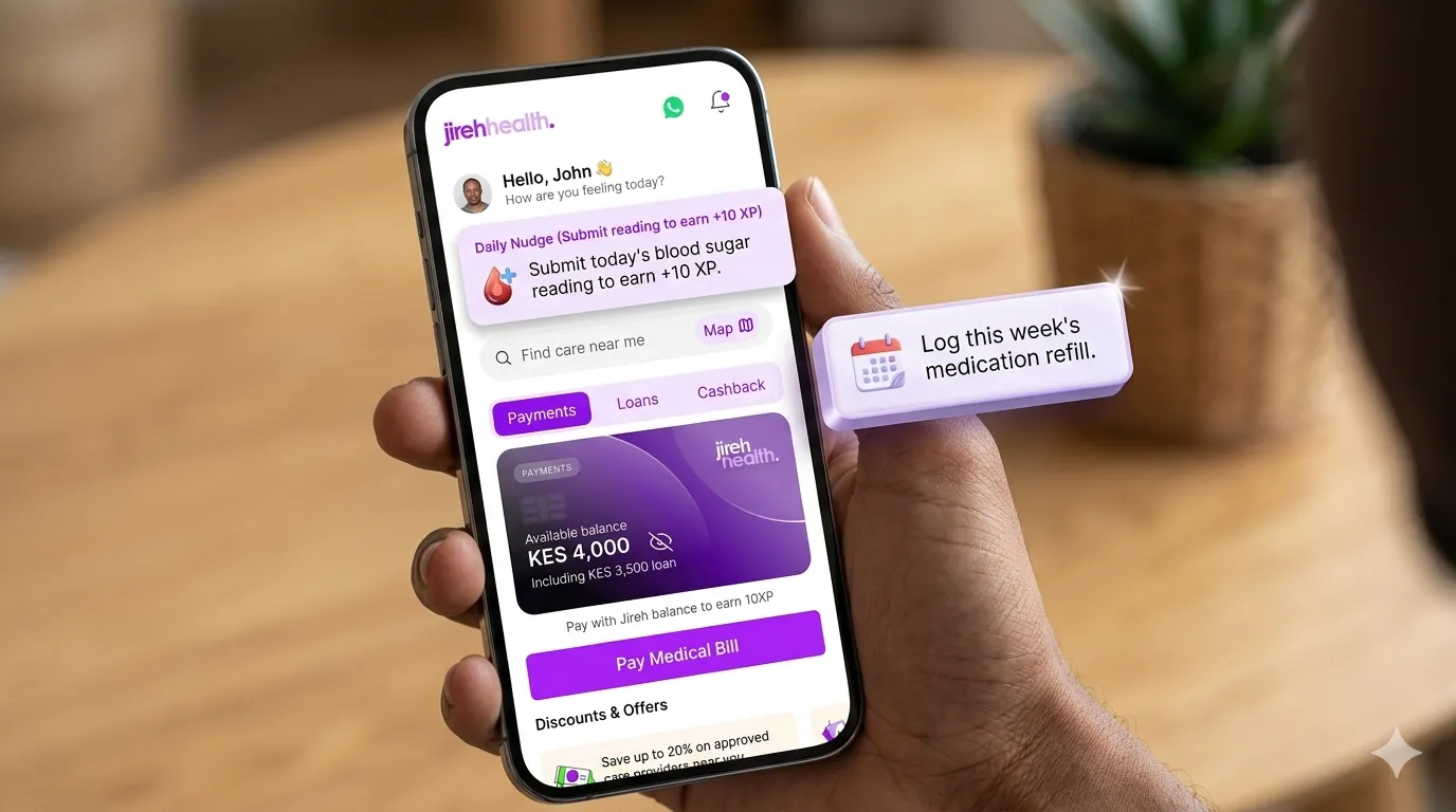
Nicholas's insight drove this directly. Caregivers knew they should be tracking vitals but had nowhere to do it reliably. I designed a contextual daily prompt, "Submit Today's Blood Sugar Reading", that surfaces the single most useful health action for that day. Completing it earns XP. The mechanic is lightweight but deliberate: it creates a habit loop, closes the data gap Jireh needs, and gives caregivers a small win in a role that rarely offers them one.
Discovery, solving Tiffany's problem
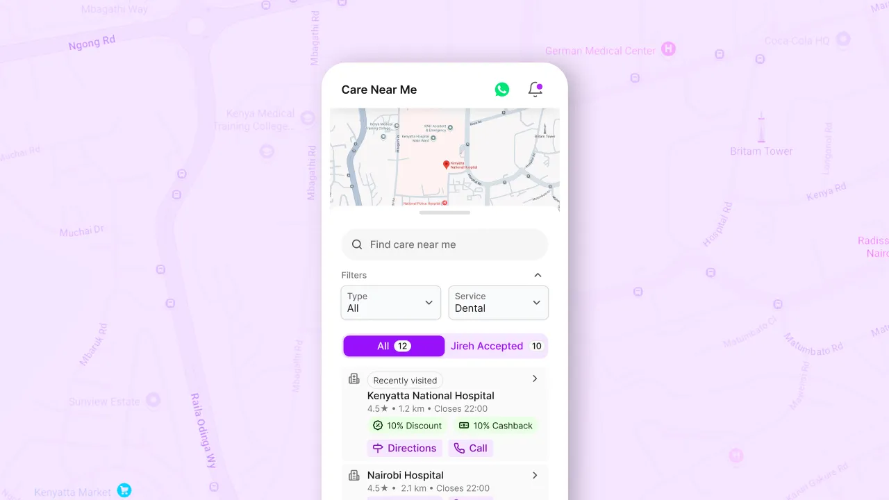
If users don't know where to spend their benefits, those benefits may as well not exist. I added a localised discovery feed showing verified nearby pharmacies and clinics with active discounts and real-time availability. A map view toggle lets users visually plot locations. A persistent banner on the home screen surfaced active offers and acted as a daily entry point into the network. Tiffany stops calling ten chemists. She opens Jireh instead.
Navigation, fixing what was invisible
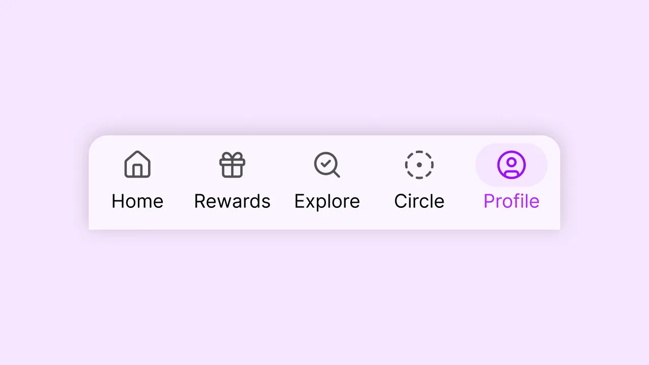
The profile had near-zero engagement. It was hidden behind a hamburger menu, predictably, nobody found it. I moved it to the bottom navigation bar alongside Explore and Rewards, and rebuilt the IA into three colour-coded tabs with clear calls to action at each entry point. Users could now understand the product's structure in one glance.
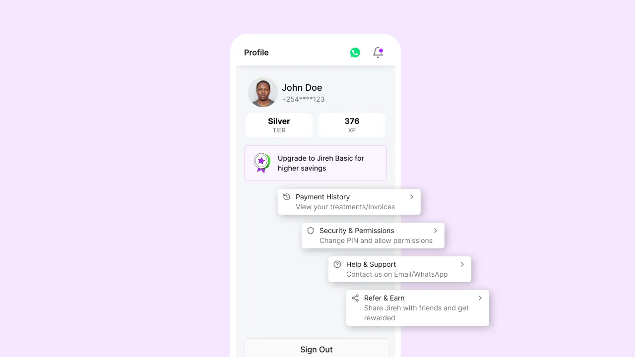
Profile (Centralized Control & Progress Tracking)
I redesigned this section to now serves as the user’s control center, combining identity, progress, and settings.
- User Controls: Access to settings, security, etc.
- Transparency: View payment history & past activity.
- Support: Easily reach help and assistance.
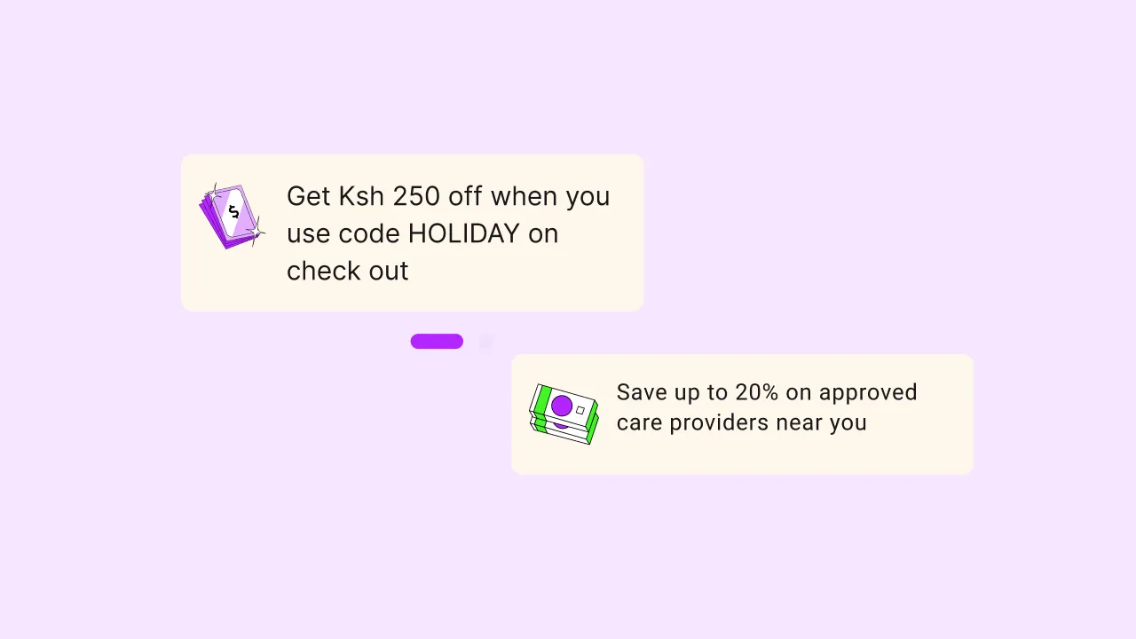
Discounts (Real Value, Right Where You Spend)
This feature makes the benefits of the app immediately tangible by showing users where they can save and how to use it in everyday life.
The Impact: Shifts the app from being just a financial tool to a practical, everyday companion—driving both usage and perceived value through visible, immediate rewards.
The cut that mattered: There was a half-built savings feature live in the product. It was incomplete, and it was confusing users. I pushed to remove it entirely rather than ship around it. The principle here was straightforward: an incomplete feature that users encounter and can't use is worse than no feature at all. We removed it with a commitment to rebuild it properly when the time was right.
User Flow: Tiffany's Tuesday Morning
- Opens Dashboard → Sees "Submit Today's Blood Sugar" prompt, and 'Available to Borrow', not a debt reminder.
- Logs the reading → One tap, done in under 30 seconds. Gets a +10 XP burst. Streak maintained.
- Checks her borrowing card → Trust Score moves from 595 to 605. Status upgrades to Silver. She understands exactly what she can access today.
- Discovery feed surfaces a nearby offer → "PharmaMart, 10% off your next refill + 50 Gems." She switches to map view, confirms it's 5km away.
- Problem solved → Under 2 minutes. She didn't have to call a single chemist.
Design 2
Jireh Circles, turning credit risk into social accountability

The Problem We Kept Ignoring
The dashboard redesign solved for daily utility. But Jireh had a deeper structural problem: credit risk. The platform was lending to individuals with no traditional collateral. The existing solution, a mandatory "Add One Person" gate during onboarding, had failed completely. Users added their 14-year-old children to bypass it. These Ghost Circles had zero accountability and made the feature meaningless.
The design question
The real question wasn't how to enforce compliance, enforcement through friction had already proven it didn't work. The question was: how do you make people want to be accountable? I drew from two frameworks that helped shape the answer.
Behavioural framing
Grameen Bank Joint Liability
In microfinance, groups police each other because one person's default hurts everyone. Social pressure works where legal enforcement can't reach.
Loss Aversion
People work twice as hard to avoid losing something they have than to gain something new. A "Circle Freeze", losing shared rewards and status, is a stronger deterrent than a late fee. Transparency replaces threat.
The Solution
The hybrid model, limited slots, unlimited reach:
I evaluated and rejected two obvious approaches. An open circle, unlimited, anonymous, would have diluted accountability to zero. A closed fixed circle would have limited growth. I designed a hybrid: unlimited invitations for viral reach, but only 2–3 active Accountable Slots reserved exclusively for verified adults. Growth and accountability don't have to be in conflict.

Fixing the invite, making it personal
The old invitation was a generic SMS link. It got deleted as spam. Drop-off was around 90%
I redesigned the invite experience around the insight that the best invitations sound human. Nicholas taps "Invite" and records a 15-second voice note explaining why, "This is for Mum's care." The SMS his contact receives reads: "Nicholas sent you a personal voice message about Mum's care. Listen here." Raymond clicks the link and hears his brother's voice before he's ever asked to sign up. I also introduced QR codes as an alternative for in-person sharing. Conversion rates followed.

Shared CareFunds and Impact Receipts
I also redesigned the fundraising experience within circles. Groups can now create shared financial goals, "Dad's November Dialysis, Target KES 15,000", and contribute directly via MPESA inside the app. When funds are used, every contributor receives a Care Impact Receipt: "Your KES 2,000 paid for Dialysis Session #4 on November 15th."
This was designed for Raymond. His money didn't vanish into a platform. It did something visible. That psychological validation is what keeps caregivers going.

Permission management and loan history
I added proper permission management to clarify what each circle member could and couldn't do, something that was entirely absent before. I also rebuilt the loan history view, which had been nearly unusable for members managing multiple loans. Each loan is now clearly distinguishable at a glance, and consolidated payment lets users clear multiple obligations in a single action.
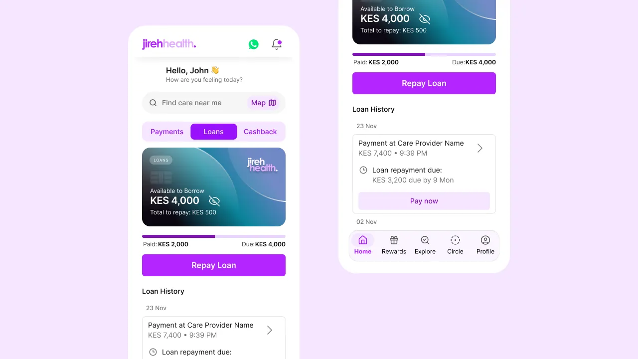

Part 3
Discount code engine, the quiet enabler of commerce
Partners (pharmacies and clinics) wanted to promote themselves. Users wanted cheaper medication. Jireh needed transaction volume. But there was no system to create, distribute, or track discounts. No analytics, no gamification, and no connection between the three parties.
.webp)
The problem with how it was being built
The original proposal required manual configuration every time a discount code was created, rules, categories, expiry, spend thresholds set from scratch each time. That was a scaling problem waiting to happen. I pushed for a preconfigured setup with sensible defaults, which removed the manual overhead and made the feature usable without a process dependency each time. This also kept the scope lean enough to ship on time.

Design Decisions
Where I held firm, and why it mattered
Some of the most important design work on this project wasn't in what I built. It was in what I argued against. These were the calls that shaped the final product.
- Removing the incomplete savings feature: A half-built feature that confuses users is worse than no feature. Removed it cleanly. The team committed to rebuilding it properly at a later stage.
- Voice + QR invitations for Circles: Generic SMS links had ~90% drop-off. Personalised voice invites matched the trust level required for healthcare-related sharing. Conversion improved meaningfully.
- Moving profile to bottom nav: A core module receiving near-zero engagement because it was hidden. A permanent, visible home in the navigation was the only sensible fix.
- User reviews on the map: Early-stage ratings from a limited user base would have introduced biased signals and made the platform look unreliable. Recommended scraping verified Google ratings as a trustworthy baseline for a later phase.
- Starting payment flow from the map: The payment flow is built around invoice parsing, upload a bill, the system extracts patient info and payment options automatically. Starting from the map would bypass all of that and require full manual entry. Discovery and payment serve different jobs. Kept them separate.
- XP, credit score, and points on the homescreen: Status metrics belong in a profile context, not as the first thing users see. Moving them freed the home screen for actionable content and reduced cognitive load at the most critical moment.
- Manual discount code creation rules: Required manual steps every time a code was created. Designed a preconfigured setup to eliminate process dependencies and make the feature scalable without operational overhead.
Process & Collaboration
How the work actually got done
I ran weekly syncs and design reviews with the founder, PM, and both engineers throughout the project. Each had a different role in the process and I worked with each of them differently. I stayed involved through QA.
PM: With the PM, the work was about alignment before the creative phase, pressure-testing my approach against the PRD and engineering docs, and getting buy-in on design direction early enough that reviews became course-correction rather than full pivots. With the engineers, I focused on feasibility early. What could we ship faster? Where were the API constraints? What inconsistencies existed between the design and what was actually buildable? Catching those early saved significant rework later.
Founder: Getting to pixel-perfect implementation requires being present in the room, not just throwing Figma files over the wall. The founder conversations were different, they were about business alignment. Whenever I was making a scope or scope-reduction call, I framed it in terms of what we stood to gain versus the risk of shipping something incomplete before our launch date.
Design had a measurable influence on scope across all three workstreams. The discount creation flow, circle setup, and dashboard redesign all shipped leaner than their original proposals. That discipline (knowing when to cut) is what kept the product coherent and launchable on time.
AI in the Process
How I used AI as a design tool not a shortcut
All AI processing was done on anonymized, aggregated data. No personal health information or financial data was ever sent to third-party AI tools. I used local models where possible and enterprise-grade APIs with data deletion guarantees.
The output, exhaustion, confusion, fear of missing medication, resentment, and guilt, gave me five emotionally grounded design principles that shaped every workstream. These became the lens I applied when evaluating whether a design decision actually helped users or just checked a functional box.
This caught several failure states that wouldn't have surfaced until QA , including what happens when an invitee already has an account, and how the voice note behaves when the recipient has no data at the moment of receiving the SMS.
Empty states are easy to deprioritise in a fast-moving sprint. Having draft copy ready meant engineers weren't left making copy decisions under time pressure, and the states shipped with tone-appropriate, human-feeling language rather than placeholder text.
Used Gemini to generate placeholder empty-state graphics for the Circle Dashboard during early prototyping , allowing design reviews to feel more complete and reducing the time spent on assets that might be cut before final designs.
Key Learnings
What this project taught me
Design debt is empathy debt The old dashboard wasn't bad because the UI was ugly. It was bad because it assumed the user's only problem was repayment. Every unchallenged assumption you leave in a product is a user you're not designing for.
Behavioural economics is not a gimmick The Trust Score, Circle Freeze, and loss aversion framing were transparent, not manipulative. Users want to understand the rules. When you show them how the system works in their favour, they engage with it.
Logistics are more emotional than features Tiffany didn't need a better rewards programme. She needed to know which pharmacy stocked the drug before she left her house. Solving the practical problem was the emotional win.
The best invite sounds human A voice note from a brother will always outperform a system-generated "Join my care team on Jireh." The medium is the message. Matching the communication channel to the level of trust required changed the outcome completely.